(Topic ID: 277923)

Welcome to the dark side, uhm, Pinside!

By robin

3 years ago


Topic Heartbeat

Topic Stats

You

Linked Games

No games have been linked to this topic.

    Topic Gallery

    View topic image gallery

    2D8FAA2F-7792-4AAC-AC15-2E818C2164E9 (resized).png
    Screenshot_20201005-055236 (resized).png
    087EFAD2-541E-4D2D-A891-3D1F978197A7 (resized).png
    IMG_3293 (resized).PNG
    2C7205EB-175B-45FC-A635-C776B5C5B984 (resized).png
    B41B4288-5A47-4F38-B81F-DDC2E4327FE6 (resized).png
    7314FD1C-BFFA-41BC-9F3C-0E40BF6C6D4C (resized).png
    08B84340-CEED-4635-8BE2-0674D8DD2464 (resized).jpeg
    0C6B2DA0-9555-48C1-BAFF-606155A1F59E (resized).jpeg
    Screenshot_20200925-133546 (resized).png
    Print Error (resized).jpg
    Screen Shot 2020-09-24 at 1.56.16 PM (resized).png
    Screenshot_20200924-134516 (resized).png
    Screen Shot 2020-09-24 at 1.04.03 PM (resized).png
    6B49506C-9254-4607-BCFF-59DCD6952C89 (resized).png
    Pinside_Manipulate_Image.gif
    There are 170 posts in this topic. You are on page 1 of 4.
    97
    #1 3 years ago

    Update part 1/2
    Today I'm pushing out an update with lots of optimisations, bugfixes and some UI improvements. This is in preparation of a bigger update coming later this year, but I decided to pull this piece of that update forward a bit because it solves some annoying bugs while I polish the big feature update that's coming soon.

    And while most of this update contains bugfixes and server-side optimalisations (i.e. boring stuff), there are a few cool front-end things that I hope you'll dig!

    Reading Pinside at night?
    One of the most requested features I had in my inbox was a dark mode option for Pinside. Turns out a lot of you browse Pinside in dark rooms. Ugh. Gamerooms. Right, why didn't I think of that sooner?

    Turns out that this was one of these things that seems easy to implement while, in fact, it took many days of work to get done right.

    Switch to dark mode and save your eyeballs!Switch to dark mode and save your eyeballs!

    It's still not completely perfect, so please report any odd-colored stuff you find, preferably with a screenshot, to my PM box, or to [email protected].

    Dark mode toggling is currently manual; You toggle it using the little sun icon in the top right of any screen. Or press CTRL-B. The setting is remembered per browser. There are plans to eventually have this toggle automatically based on your time of day or OS setting, but that's something for the future.

    (btw, the logout icon has moved and now appears when mousing over your user name, or go to your profile page and find the logout button there. I mean, who ever logs out right?).

    Slightly bigger fonts
    While designing dark mode, I also decided to increase the overall font size for Pinside slightly. This follows design trends and also helps my own old eyes.

    New PM design
    I'm working on a PM screen design specifically tailored to messaging about Marketplace ads. This will include information to help you determine if someone is legit. This is not entirely finished yet but the PM screen already has a new look. Instead of repeating someones profile information (the "backbox") a gazillion times, I now only display this once and then use only the avatar for a much cleaner and leaner look.
    talking_to_myself (resized).pngtalking_to_myself (resized).png

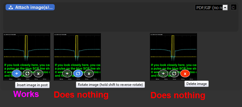
    Improved image tools
    I have made some improvements to image tools. The tool buttons will now always be visible. Easy rotating!

    Speaking of rotating, that pesky rotation bug should be fixed now!

    There is also a cool new "sorting mode", which will help you put your images in order. This only works right after uploading them, when they're not yet auto-inserted in your post text.
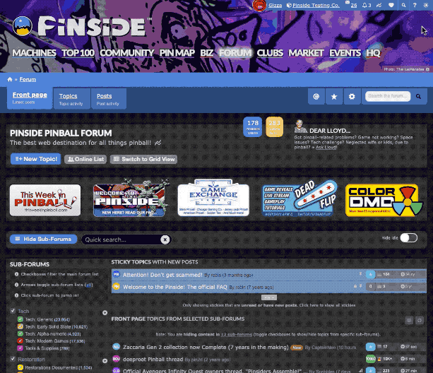
    roation_and_sortingmode.gifroation_and_sortingmode.gif

    Cleaner homepage
    Clean up the home page by hiding the sub-forums. Easy peasy and it is remembered accross devices.
    Hide the sub-forums side-bar for a cleaner forum home page!Hide the sub-forums side-bar for a cleaner forum home page!

    Bugfixes create new bugs
    I think this update touched about 90% of all Pinside code. So yes, there will certainly be new bugs. Report them to me via PM or in the Pinside >Bugs sub-forum please!

    More cool stuff...
    Almost ready, but not quite yet. Soon!

    #2 3 years ago

    Is it control d or control b? Your post says b but top of page says d (I can't try as I'm on a mobile). Good work as always, I like the marketplace ad changes

    #3 3 years ago
    Quoted from PinballTilt:

    Is it control d or control b? Your post says b but top of page says d (I can't try as I'm on a mobile). Good work as always, I like the marketplace ad changes

    Control B works for me.

    #5 3 years ago

    I'm liking the dark mode!

    #6 3 years ago
    Quoted from PinballTilt:

    Is it control d or control b? Your post says b but top of page says d (I can't try as I'm on a mobile). Good work as always, I like the marketplace ad changes

    Oops! It's CTRL-B. I changed the hint text.

    I changed this pretty last minute because it appears CTRL-D is already taken for making bookmarks (on Windows) I'm on a Mac myself, so I didn't notice this until final testing.

    #7 3 years ago

    Excellent updates @robin. Great job always making improvements.

    #8 3 years ago

    Wonderful implementation! I *love* dark mode, and will be using it full-time. Thanks for making it happen, @Robin!

    #9 3 years ago

    Looks good!! Keep up the awesome work Robin!!!!!

    #10 3 years ago

    robin One thing I Noticed is the graphic for the sub-forum drop down arrow is now cut off on an iPad

    62E19A81-74B9-4ED5-8FE8-DAE7A8D60D12 (resized).jpeg62E19A81-74B9-4ED5-8FE8-DAE7A8D60D12 (resized).jpeg
    #12 3 years ago

    robin I also noticed when I go back to a previously read page on a thread, the bottom add banner is showing up before the bottom of the page.

    Here you can see it loaded before the 110th post. Usually it would load after 50 posts.

    * I got an upload error with the pic.
    Did not get an upload ID: unknown error

    #13 3 years ago

    I have been wanting a dark mode on Pinside for so long. Thanks, Robin!

    #14 3 years ago

    Love the new dark mode, the new font is a little rough though.

    #15 3 years ago

    I'll be that guy. I'm not a fan of the font, and I HATE the ads showing up after the a few posts in any given thread. Why "clean up" the main page, only to mess up the threads? Hopefully this is an error.

    (I do like dark mode though)

    #16 3 years ago

    Due to the calming affect of dark mode, I expect 30% fewer inflammatory posts.

    #17 3 years ago

    Like the dark side, but the larger fonts are tough on mobile.

    The banners take up the entire screen on my iPhone now. Can you go back or give us the option to reduce them please.

    C9E65B0C-94F7-4E61-8676-0217D6624CA2 (resized).pngC9E65B0C-94F7-4E61-8676-0217D6624CA2 (resized).png
    #18 3 years ago

    I like the larger fonts, getting old sucks

    #19 3 years ago

    robin would you consider allowing Pinside+ members to turn off the promoted items that now show up in the middle of threads?

    #20 3 years ago
    Quoted from woody76:

    I like the larger fonts, getting old sucks

    That what bigger phones and monitors are for.

    #21 3 years ago

    Overall great job. I'm not a fan of the new PM layout, but then again I'm adverse to change for the most part.

    #22 3 years ago

    I'm diggin' it! Thanks !

    #23 3 years ago

    I read a couple of topics before I read this one, and I was wondering how the font settings in my browser got changed.

    Nice job, Robin!

    #24 3 years ago

    I'm digging the dark Pinside mode.

    Personally, and maybe this is the American in me, but the new PM design seems to be counterintuitive. In almost every messaging service I've ever used, your messages appear on the right and the responders messages appear on the left. Love the new blocking, but I think this should be reverse.

    #25 3 years ago

    Thank you so much for Dark Mode. Awesome addition!

    #26 3 years ago

    Really liking the dark mode.

    Did find one bug on dark mode. Just looked at some game ratings and the text on ratings is black, making it difficult to read.

    #27 3 years ago
    Quoted from Yoko2una:

    I'll be that guy. I'm not a fan of the font, and I HATE the ads showing up after the a few posts in any given thread. Why "clean up" the main page, only to mess up the threads? Hopefully this is an error.
    (I do like dark mode though)

    Quoted from Wolfmarsh:

    robin would you consider allowing Pinside+ members to turn off the promoted items that now show up in the middle of threads?

    I like everything about the update except this. The pinside + option is a good idea.

    #28 3 years ago

    Looks great!

    #29 3 years ago

    On an android phone. I was able to get dark mode by clicking your initial link, but cannot return to normal, as I don't see the icon at top right.
    *** Edit.... Found it in the little drop down menu up there

    #30 3 years ago

    Only thing I'm not wild about is the red text on the marketplace items. Retinal burn.

    #32 3 years ago

    Thanks for the feedback thus far! I'm considering all requests and will try to fix any issues asap.

    Font size is easily adjustable on desktop via ctrl-+ and ctrl--, but not so much on mobile. So I'm considering adding a site-wide font size setting for content. Small (which was the default up to today), medium (current) and maybe also large. We're talking font size 13px, 13.5px and 14px respectively.

    I'm also working on a "automatic" dark mode setting (follow your operating system), turns out that's pretty easy to implement. This will be combined with a proper cross-device setting (currently a cookie, which does not work for all users). This should be ready soon!

    And lastly, hiding the promo box is already possible for + members:

    pasted_image (resized).pngpasted_image (resized).png
    See https://pinside.com/pinball/forum/settings

    If you like my work you can always say thanks by making your gray heart red. Red hearts are a great motivation!

    #33 3 years ago

    Font size on mobile is an excellent idea.

    Great work Robin!

    #34 3 years ago

    Like the dark mode. I had problem where it kept flipping back to bright mode after clicking on Forum at top of page. Seems to be fixed now. I still notice that pictures are shaded/less saturated in dark mode. Image will appear normal when you hover mouse over it.

    #35 3 years ago
    Quoted from jawjaw:

    I still notice that pictures are shaded/less saturated in dark mode. Image will appear normal when you hover mouse over it.

    This is by design. Following guidelines/ideas for dark mode that I found on the web, I have reduced the display brightness of images on the forum. They will show full color when mousing over them or, on mobile, by tapping them to view in full screen "gallery" view. This dimming only happens in darkmode.

    #36 3 years ago

    Dark mode and the larger font size are excellent improvements, great work!

    #37 3 years ago
    Quoted from Yoko2una:

    HATE the ads showing up after the a few posts in any given thread

    Quoted from gliebig:

    Really liking the dark mode.

    Quoted from Wolfmarsh:

    robin would you consider allowing Pinside+ members to turn off the promoted items that now show up in the middle of

    Quoted from Rhyme0rc:

    Thank you so much for Dark Mode.

    Agree with all.

    #38 3 years ago
    Quoted from robin:

    And lastly, hiding the promo box is already possible for + members:

    It's not the hiding of the promo box. In fact, sometimes I've actually seen things I'd be interested in. It's just super annoying that it now shows up randomly in between posts and not at the bottom of the page.

    I'm 100% sure I'm not the only person today has been in a thread, seen the promo box and thought it was the end of the page (because we're conditioned to think it's located at the bottom of the page) and then didn't realize there were more posts. It's completely unnecessary to have it randomly up in the posts, and annoying to break up the flow of information.

    #39 3 years ago
    Quoted from robin:

    And lastly, hiding the promo box is already possible for + members:

    pasted_image (resized).png

    See https://pinside.com/pinball/forum/settings
    If you like my work you can always say thanks by making your gray heart red. Red hearts are a great motivation!

    Wow. I just found that feature. Thanks for pointing it out, and for all your hard work. The results are great, I like the improvements

    #40 3 years ago
    Quoted from Yoko2una:

    It's not the hiding of the promo box. In fact, sometimes I've actually seen things I'd be interested in. It's just super annoying that it now shows up randomly in between posts and not at the bottom of the page.
    I'm 100% sure I'm not the only person today has been in a thread, seen the promo box and thought it was the end of the page (because we're conditioned to think it's located at the bottom of the page) and then didn't realize there were more posts. It's completely unnecessary to have it randomly up in the posts, and annoying to break up the flow of information.

    I agree. I've found some cool mods in the promoted items area. I personally would never click on something I wanted to buy if I was in the middle of reading.

    #41 3 years ago

    This f*cking rocks.
    We are so lucky to have you.

    #42 3 years ago
    Quoted from robin:

    Font size is easily adjustable on desktop via ctrl-+ and ctrl--, but not so much on mobile. So I'm considering adding a site-wide font size setting for content. Small (which was the default up to today), medium (current) and maybe also large. We're talking font size 13px, 13.5px and 14px respectively.

    Let me clarify, my comment wasn't about the content font. It is about the banners and 'buttons' on mobile. This text never changes so there is little value in making them larger just to take up space that could display thread content. My front page page now only shows 1 thread title.

    #43 3 years ago
    Quoted from Black_Knight:

    Like the dark side, but the larger fonts are tough on mobile.
    The banners take up the entire screen on my iPhone now. Can you go back or give us the option to reduce them please.
    [quoted image]

    Thanks. I will absolutely look into that aspect of the general Pinside design some more in the coming days.

    #44 3 years ago

    love Dark mode.
    the 'ad bar' being in the middle of the page will take some getting used to. To be honest, I wonder if I will 'see it' less as I scroll past it, vs at the bottom where I see it while I click to go to the next page as I am not reading something else.

    As always, really appreciate your efforts in continuing to make this place better.

    #45 3 years ago

    I'm seeing a new bug, could potentially be a major issue. I can't upload a lot of photos to the below ad. I get a "could not get an upload ID" error on Android. I have tried clearing cookies and using multiple browsers. I also tried selecting single images and multiple ones. The file sizes are around 1.5MB. The format is JPEG from an Android phone.

    https://pinside.com/pinball/market/classifieds/ad/102920

    #46 3 years ago

    I honestly didn't mind the ads at the bottom of a thread at all. I even kind of liked it when it showed me stuff specific to a game discussed in the thread and I found some cool stuff that way. That said, I f'ing hate them popping up in the middle of the thread. It reminds me of paid advertisement crap disguising itself as posts on a Facebook or Instagram feed. I find it obnoxious and a distracting interruption from the conversation I am reading. Making it more "in my face" is going to have exactly the opposite effect that you want...I am going to be annoyed by it and purposely not click on it because of that. Please consider putting them back on the bottom where I can peruse them as I wish AFTER reading through the thread.

    On a positive note...dark mode is a great option. Not sure if I will use it all the time or not, but I love the simple option. The PM upgrade also looks like it will be nice. Good stuff, thank you!

    #47 3 years ago

    Great job pushing out the update, Robin!

    I couldn’t figure out why in Dark Mode I had one less header box showing up. Now I see it’s because of the font size update! Very cool.

    Honestly I barely noticed it. I think somewhere it’s been said that if your updates are barely noticeable and are user intuitive then that’s a job well done!

    #48 3 years ago

    I love dark mode - THANK YOU

    #49 3 years ago
    Quoted from robin:

    And lastly, hiding the promo box is already possible for + members:

    Thanks Robin!!!!

    #50 3 years ago

    I love it. Makes it better on my eyes.

    There are 170 posts in this topic. You are on page 1 of 4.

    Reply

    Wanna join the discussion? Please sign in to reply to this topic.

    Hey there! Welcome to Pinside!

    Donate to Pinside

    Great to see you're enjoying Pinside! Did you know Pinside is able to run without any 3rd-party banners or ads, thanks to the support from our visitors? Please consider a donation to Pinside and get anext to your username to show for it! Or better yet, subscribe to Pinside+!


    This page was printed from https://pinside.com/pinball/forum/topic/welcome-to-the-dark-side-uhm-pinside/page/1 and we tried optimising it for printing. Some page elements may have been deliberately hidden.

    Scan the QR code on the left to jump to the URL this document was printed from.