
 San Jose, CA
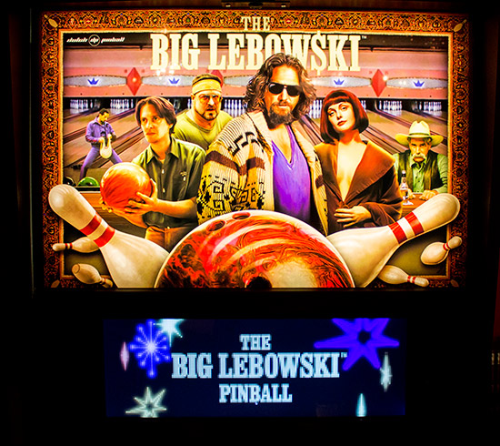
tl;dr - The dollar sign in Lebowski bothers me a lot.
Let me preface this by saying I am a huge fan of The Big Lebowski. I've seen the movie 30+ times. I can quote most of it. When the table was announced, I was excited to an insane degree. I knew I would cling to any/all news as it arrives to help me decide whether or not I should buy it.
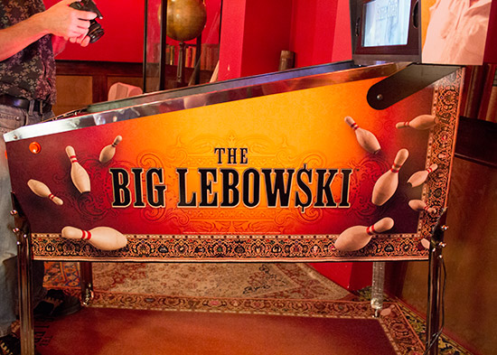
Dutch Pinball sent out the first teaser video back in July and something immediately struck me -- the dollar sign instead of an "S" in Lebowski really stood out and felt unnatural to me. I first went to my Blu-Ray and HD-DVD copies of the film to look at the artwork. No dollar sign.
I then turned to Google Image Search and poked around a bit. The various official movie posters I could find didn't have a dollar sign.
As best I could tell from my digging, the dollar sign only appeared once -- on the 10th Anniversary DVD. My guess is the Coen brothers (or somebody) added this as a joke about double-dipping and getting people to buy the same movie on DVD once again.
I sent an email to Phil at Dutch Pinball about this, right away when I got the teaser video back in July. My hope was that it was early enough in the process that the artwork could be changed to a more "correct" version. The Pinball News preview came out last week and the dollar sign is still there.
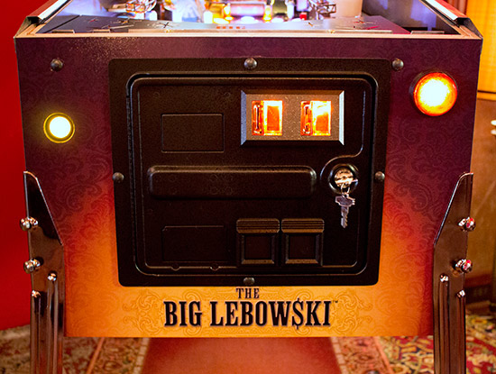
I sincerely wish this didn't bother me as much as it does. And perhaps I'm the only one? But I want this table to be amazing and succeed and be as close to perfect as possible. To me, the dollar sign just might be a dealbreaker (for me) when it comes to owning this machine. Let's face it, the market for this pinball machine is Lebowski super-fans and super-fans are going to notice things like this. It's everywhere -- the cabinet, near the coin door, on the translite, so it's pretty in-your-face.
Anyway, Dutch Pinball didn't respond to either of my emails so I'm starting this thread to, if nothing else, raise awareness. It's also possible that I'm the only person this bothers and they'll do just fine on the game without my $8500. If it at all bugs you, please weigh in.
 Beauharnois
 Weesp
Weesp
 Upper Hutt

