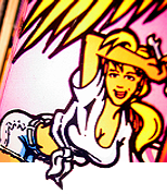
Quoted from Mikonos:...avoiding using vectorization...
The only issue with that is, that while the original artwork was hand drawn, it was converted to vector art(hence the computer generated half-toning as seen in the leaf on the flower) for the use of standardized Pantone spot colors as the artwork was screen printed directly onto the cabinets and the only way to hit those colors exactly is by printing with only those colors. With your Photoshop method, because the images are raster, when it comes time to print these out it'll be a four color process and while you'll get some colors dead on, others will be off and there's really no way around this. The most accurate way to replicate the original artwork for the most accurate reproduction, is to vectorize it and use all spot colors as they are standardized colors that have definite values that any print shop worth its salt should be able to hit dead on.
This same situation is evident in the two different runs of the TAF playfield by CPR, one screen printed, the other inkjet printed. The screen printed one is more vibrant and the colors are dead on when compared to the Pantone Spot colors that are called out for each screen(and there are a LOT of screens!). The inkjet one, which is essentially a CYMK/four color process, will be close, but some of the colors will be very noticeably off. Even CPR themselves say this on their site about the neon orange color of the Power Cloud.
Keep in mind, too, that the scans you're taking of one particular cabinet's artwork will be completely different from someone else's game. Due to the way these were screen printed, the centering of each screen was never perfect. So, one game's yellow is 1/8" off to the left while the very next game on the line's yellow is 1/8" off to the right. These imperfections can be left in as a way of maintaining some form of replication of original production, but these imperfections were never actually intended. Using the scan of the leaf again, you can see how the screen for green half-toning was laid down to the left of where it's supposed to be. I'm sure that's not where the original artist wanted it to be. Same can be said for the purple in the flower petals, and where the lightning meets the yellow. This "drift" of screens was extremely common back then on just about every game they made, unfortunately.
None of this means what you're doing is wrong or bad in any way, shape, or form. So please don't take it that way. I've redone some TAF artwork myself and have left in some of the imperfections as well, to help make it look more authentic and similar to the way they produced them. I'm just warning you about the kind of things you might expect to see when it comes time to print. With raster images(in Photoshop), your edges will have a slight blur to them and the colors will be slightly off. If they were vectored, every line would be 100% crisp and sharp, and you could use the Pantone Spot colors to guarantee accuracy.
Here are a couple examples from my own samples and artwork I've done:
These first two show the clarity and sharp edges that you retain with vector art when zooming in and when you end up printing- Far away
Zoomed in
This one shows the difference with spot colors and CYMK printing. Even though the color I specified in the artwork is the exact color used on the cabinet side(I have a swatch book that I used to match it), the inkjet printer just can't get it correct. It's close, but it's just not right. CYMK vs Spot
I hope all this info helps you on your journey with reproducing this artwork. I know from firsthand experience that it's no small undertaking, but it's a labor of love and can be really fun and fulfilling.
Good luck!


