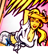
Thanks! I'm thrilled to get such positive reception from the community. I've been working on it for a long while and I'm really excited for the finished color version to get out there soon (it's been updated a bit since this line art). For the record, this is an original design that I created and isn't related to an AP game. Stay tuned! ![]()
I quite like it.
If you're looking for constructive criticism I've got two things (both are boob related as boobs are two of my top five favorite things). ![]()
1) Larger boob size.
2) More cleavage.
Quoted from mbwalker:Darn, now my Monkey tee is obsolete.
More like limited edition.
Now it is a collectors item.
Quoted from Coindork:I quite like it.
If you're looking for constructive criticism I've got two things (both are boob related as boobs are two of my top five favorite things).
1) Larger boob size.
2) More cleavage.
I think it's good, but no harm in it being a little more feminine, even in these PC times!
T-shirt B/W and color, poster, and stickers are planned stay tuned!
The monkey still lives here as well she isn't a replacement
Quoted from DanDanDAN:T-shirt B/W and color, poster, and stickers are planned stay tuned!
The monkey still lives here as well she isn't a replacement
Do a work shirt like you did with Houdini. Seemed like a good seller. I waited to long and was aced out on that one. I’d totally pick up on one with this art.
Boys will be boys, I agree with them, I combined Stern's Elvira Back Glass with the logo what do you guys think of the quick render / redraw ?
Quoted from Coindork:I quite like it.
If you're looking for constructive criticism I've got two things (both are boob related as boobs are two of my top five favorite things).
1) Larger boob size.
2) More cleavage.
Quoted from cosmokramer:Love the art style and subject matter...she needs more curves
Quoted from Shapeshifter:I think it's good, but no harm in it being a little more feminine, even in these PC times!
Quoted from kklank:Meh. Kind of looks like a dude. Make her more feminine.
Quoted from o-din:I'd like to see a game with the bird lifting up her skirt with it's beak on the backglass.
I like it, screams... 'merica. Ignore the haters and posters who want more curves and disproportionate parts.
Real question is: Red head, blonde, brown, or raven hair? My vote is red
Amy Pinn could work well for more female focused games: Amelia Earhart, Joan of Arc, WW2 pin with Amy and Rosie the Riveter (all if you want to keep non-licensed).
It just dawned on me Amy Pinn is a play on AMerican PINball. Get it ? I’m either pretty clever or half an idiot if that’s obvious to everyone else. Lol
Quoted from PinballSTAR:It just dawned on me Amy Pinn is a play on AMerican PINball. Get it ? I’m either pretty clever or half an idiot if that’s obvious to everyone else. Lol
You're one of the good ones Joe!
Quoted from Mitch:So the real question is what will come first mascot number 3 or game number 1.
I assume you meant to say game number 3??
Quoted from Coindork:I quite like it.
If you're looking for constructive criticism I've got two things (both are boob related as boobs are two of my top five favorite things).
1) Larger boob size.
2) More cleavage.
I completely agree! Pinball always brings out the 15 year old in me...
Coming from an illustrative background, I feel the eagle needs some refinement, lose some of the peculiar angles of the beak, refine it's chest and form a bit, or just define it more.
Her shoulders and hips are quite matched up, for me anyway, appropriately. I like her face a good bit!
The eagle would be a bit too weighty to hold on a forearm. Maybe it, or a bomber, could be releasing those pinballs above her head?
I like the angle of her gaze, shows a dynamic nature sans an over the top pose.
I feel like her straps could use a bit more contour, flow with her form/figure, and show a bit more depth.
Nice overall design, and conveys a message pretty easily overall!
Quoted from DRDAVE:Joel is da man!
...referring to Joel de Guzman, who is also Artist-in-Chief for Pintastic New England. We New Englanders are so proud of him!
.................David Marston
Quoted from wesman:Coming from an illustrative background, I feel the eagle needs some refinement, lose some of the peculiar angles of the beak, refine it's chest and form a bit, or just define it more.
Her shoulders and hips are quite matched up, for me anyway, appropriately. I like her face a good bit!
The eagle would be a bit too weighty to hold on a forearm. Maybe it, or a bomber, could be releasing those pinballs above her head?
I like the angle of her gaze, shows a dynamic nature sans an over the top pose.
I feel like her straps could use a bit more contour, flow with her form/figure, and show a bit more depth.
Nice overall design, and conveys a message pretty easily overall!
This is the type of constructive feedback that I appreciate - thanks! All good pointers. I think it’s too late in the game to make drastic changes, but it has evolved a bit since this version and the full color art (which should be coming soon) definitely has a lot more depth, light, and shadow. I’ll certainly keep your comments in mind for whatever I do next! ![]()
Quoted from bobukcat:I assume you meant to say game number 3??
I did lol. Early morning. Looking forward to the next one.
The many sexist comments bring to mind this Oatmeal sketch. https://theoatmeal.com/blog/spiderwoman
Quoted from Coindork:I quite like it.
If you're looking for constructive criticism I've got two things (both are boob related as boobs are two of my top five favorite things).
1) Larger boob size.
2) More cleavage.
True. I’m proud of my wife’s, and the way my coworkers dress, they’re fans of the upper torso accouterments themselves.
Hey, it’s nature.
Quoted from jackd104:The many sexist comments bring to mind this Oatmeal sketch. https://theoatmeal.com/blog/spiderwoman
Lol... "sexist comments"
Quoted from Coindork:I quite like it.
If you're looking for constructive criticism I've got two things (both are boob related as boobs are two of my top five favorite things).
1) Larger boob size.
2) More cleavage.
The way the monkey got them spanked I'm surprised they aren't concave.
Quoted from Number41:This is the type of constructive feedback that I appreciate - thanks! All good pointers. I think it’s too late in the game to make drastic changes, but it has evolved a bit since this version and the full color art (which should be coming soon) definitely has a lot more depth, light, and shadow. I’ll certainly keep your comments in mind for whatever I do next!
Thank you for receiving them well, and above all for putting in some hard work, use of your skill, and passion in helping API with their branding!
Quoted from jackd104:The many sexist comments bring to mind this Oatmeal sketch. https://theoatmeal.com/blog/spiderwoman
Sexuality and sexism aren't necessarily always the same concept. We can sexualize, see sexuality, crave it, and not demean, demoralize, or devalue a person in the same sense. Empowerment of sexuality can often negates sexism.
And yeah, that Spiderwoman cover was just egregious for anatomy reasons alone.
OK
so this is what I have learned...
Rest of the internwebs: Hey that is pretty awesome I would buy that on a T-shirt
Pinside: MOAR BEWBS!!!
=)
Quoted from Number41:This is the type of constructive feedback that I appreciate - thanks! All good pointers. I think it’s too late in the game to make drastic changes, but it has evolved a bit since this version and the full color art (which should be coming soon) definitely has a lot more depth, light, and shadow. I’ll certainly keep your comments in mind for whatever I do next!
Joel, you were hired by American Pinball to design something that we liked, that represented us as a company... You knocked it out of the park!!
The overall reaction is incredible.
Awesome Job.
Here’s an interview I did with Joel de Guzman, new artist at American Pinball. You can find this on the Special When Lit Pinball Podcast Facebook page.
https://www.facebook.com/2030776680530449/posts/2432703420337771?d=n&sfns=mo
Quoted from Coz:Here’s a full color version.[quoted image]
Wow that looks really good
Quoted from zahner:That's very cool. Is the person pictured in your Pinside icon the inspiration for "Amy"?
I’m not the artist. His name is Joel De Guzman
I did an interview with him a few weeks ago. Look at post 44 for a link if interested
Reply
Wanna join the discussion? Please sign in to reply to this topic.

Hey there! Welcome to Pinside!
Donate to PinsideGreat to see you're enjoying Pinside! Did you know Pinside is able to run without any 3rd-party banners or ads, thanks to the support from our visitors? Please consider a donation to Pinside and get anext to your username to show for it! Or better yet, subscribe to Pinside+!


 Woodridge, IL
 Wellesley, ON
