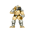
Playfield art looks freaking awesome! I can't imagine what it actually looks like in person - photos never due justice to the real colors and detail. Flesh tones and color palette I think were chosen well. I really like that the Predator was moved up and in to keep as much of him visible as possible (even now it looks like a good chunk of that beautiful art will be covered by the apron/drain guide) and swapping out Dutch's face for a skull was a great move.
Couple things to consider/reiterate:
Granted this isn't on a real playfield, but it looks like the top of Dutch's head may get cut off by one of the triangular inserts... This was a big f'up that stern over looked on the Transformers LE that they got a ton of crap for - sucks looking at my LE and seeing part of Megatron's face missing.
The blood red skull (although a large chunk will be obscured by the lane guides and sling plastic) may benefit from more hue variations to match the rest of the playfield color style.
If he has the time to fix Dutch's shoulder I think that would be a huge improvement. Glaring anatomy issues right dead center in the playfield on the main character is going to be cause for controversy on an otherwise incredible piece of art and pinball history. Hate to see a bunch of haters because of someone's shoulder.
With all that said, I repeat, bloody freakin awesome art. If nothing changed I'd still be speechless and in awe when I uncrate this baby and put it in my line-up.

 Saint Paul, MN

