(Topic ID: 26628)

New Predator Info Thread

By SkitBPinball

11 years ago


Topic Heartbeat

Topic Stats

  • 7,117 posts
  • 329 Pinsiders participating
  • Latest reply 10 years ago by robin
  • Topic is favorited by 48 Pinsiders

You

Linked Games

Topic Gallery

View topic image gallery

image-108.jpg
mondocreepshowvariant.jpg
603014_10152354237528677_125651998_n.jpg
Predator2.jpg
predator.jpg
image.jpg
ladypredator.jpg
Free-Shipping-Jewelry-Earring-display-font-b-Necklace-b-font-showcase-Jewelry-Display-Rack-stand-font.jpg
26.jpg
23.jpg
1392926019628.jpg
20140220_135226.jpg
predatormaskoff.gif
predator-homeworld-cartoon.png
image-450.jpg
image-815.jpg

This topic is closed.

There are 7,117 posts in this topic. You are on page 63 of 143.
#3101 11 years ago
Quoted from iceman44:

The color palette on Special Forces looks better at this point....
Well, the gameplay, modes, theme etc....is what's gonna make this pin fun....not necessarily the artwork, and that's ok for the $$, Jpop is still secure in that area....

Wait for the blacklight

#3102 11 years ago

this is the raven of the future ,therefore a success

14
#3103 11 years ago

Sorry guys, but I don't have the time at this very moment to go through and respond to all of these comments (though I did read them all). I will try to touch down quickly on the major stuff:

Blondetall: Don't feed guys breast info. This information will not be handled with care

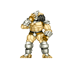
Skinned body toy: Prototype toy in testing position. The newest (final, I'm thinking) will be here on Saturday with some other cool stuff. He will interact with the ball by way of the left ramp, but has a tendency to shake and sway with general nudging and pop-bumper-action that I really dig. Also, plastics will obviously play a large part in his appearance on the final game.

DMD/Software: The software in the game is our newest batch. A handful of major changes since it was in Chicago along with a TON of minor changes for balance control and debugging. Most notable difference in the software that you'll see immediately is the new DMD action. Literally every animation has been redone with lots of added effects, fonts, instructions... Lots of jazz on-screen now, but I don't believe it is distracting or disorienting at all. Many new animations have been added in, as well, in situations that didn't have an animation before. All of these things have been optimized for the new 16-color LED display, also. Also, lots of new sounds and call outs have been added to this build. The infamous "ain't got time to bleed" is finally present, along with some other good ones that hadn't been implemented yet.

Hardware: Outside of the clear ramps, if you haven't had a chance to see them yet, not a lot of change on the hardware side of this prototype. We couldn't get some things in line quickly enough to have our newest one available for play, so we brought "old faithful" from the Chicago expo. We actually had to sprint to reassemble it before the show, so if it blows up, uhh, it's Aaron's fault.

Company stuff: We have a few big announcements to make on Saturday during our seminar / fireside. All good news, stay tuned!

Artwork: Thank you for all of the responses! Two quick things, here. First, the artwork is not finalized, but, as you can see, is VERY close. Secondly, we are getting a lot of input, reactions and feedback both here at the expo and here on PinSide, and it's fantastic. How any other company can make major decisions about this kind of stuff without consulting the fan base is beyond me. While we surely can't make changes for everyone, we most certainly take all comments seriously. Keep the comments coming, but keep them constructive. Also, "this is awesome" messages are always helpful

Alright, off to bed for another few hours of sleep before hitting the expo floor again in the morning!

PS: Ted, I got your email and we're still on

#3104 11 years ago

You know, hopefully the artist is reading this, because two of the critiques I had when the first batch of drawings hit were; A) Dutch's head suffering from serious "flat face" comic syndrome, and; B) Mac's tiny lips. I said that I thought Dutch's flat 2D face would be addressed with color, but, DAMN ME, I did not think it would be that good. Dutch's face is a masterpiece. And, of tertiary importance, Mac's majestic lips got the respect they deserve.

Cheers man! Well, well done.

(No one's going to notice that branch hiding Dutch's hand because his face is so awesome!)

EDIT: OOooo, posted right as I did!

Quoted from SkitBPinball:

Blondetall: feed guys breast handled with care

You dirty bastard, Kevin.

#3105 11 years ago

Sorry boys, looks like I am banned from breast talk. (Even though you all started it. And I swear I first read that as "dont breast feed guys...") Guess you'll just have to talk about playfield art now.

Yay! Playfield art! I am looking forward to more updates on Saturday. Any chance of a DMD video at some point so we can see a difference? I was concerned about the original patchwork look but assume it is much better now with at least 1 or 2 upgrades since then.

#3107 11 years ago

Looks pretty good, I'm curious to see how it looks all put together. Maybe someone can work some Photoshop magic and combine them both.

Looks like this artist doesn't like drawing hands.. I can't say I blame him, I don't like drawing them either.

#3108 11 years ago

I love the artwork, hand drawn art is my favorite! The only thing I would change is make the red skull a white skull instead. The red just doesn't jive for some reason. I can't wait to see the plastics,video of the updated dmd and gameplay. Not to mention the info from the seminar. This weekend is gonna ROCK and I'm not even there!

#34

#3109 11 years ago

Playfield art looks freaking awesome! I can't imagine what it actually looks like in person - photos never due justice to the real colors and detail. Flesh tones and color palette I think were chosen well. I really like that the Predator was moved up and in to keep as much of him visible as possible (even now it looks like a good chunk of that beautiful art will be covered by the apron/drain guide) and swapping out Dutch's face for a skull was a great move.

Couple things to consider/reiterate:
Granted this isn't on a real playfield, but it looks like the top of Dutch's head may get cut off by one of the triangular inserts... This was a big f'up that stern over looked on the Transformers LE that they got a ton of crap for - sucks looking at my LE and seeing part of Megatron's face missing.

The blood red skull (although a large chunk will be obscured by the lane guides and sling plastic) may benefit from more hue variations to match the rest of the playfield color style.

If he has the time to fix Dutch's shoulder I think that would be a huge improvement. Glaring anatomy issues right dead center in the playfield on the main character is going to be cause for controversy on an otherwise incredible piece of art and pinball history. Hate to see a bunch of haters because of someone's shoulder.

With all that said, I repeat, bloody freakin awesome art. If nothing changed I'd still be speechless and in awe when I uncrate this baby and put it in my line-up.

#3110 11 years ago
Quoted from SkitBPinball:

PS: Ted, I got your email and we're still on

Whoo hoo! NOW I'm really happy!!

#3111 11 years ago
Quoted from navajas:

Glad you're a buyer, not the designer!
Filling in those blue spots with plastics which will obviously have green jungle art on them will hopefully satisfy the (to me, inexplicably bizarre) folks who would want it to look more like Special Force. There's a lot of those spots. Take a gander.
The palette however, is perfect, and WORLD'S better for this machine than Special Force. I can't wait to see it lit.

Lol...Bizzare? I guess most of us are bizarre then..the movie is set in a jungle, to forgo that atmosphere would have been unforgivable, also I certainly hope the art would be better than SF, that game was from Bally's lost years in the 80's, with that said for that era the overall look,ramps and the plastic canopy in that game deserves special applause. Last thing, with the UV paint most of us will be playing this game with the lights off...

#3112 11 years ago

I wonder if the guides and sling plastics will have art overlay?

I think Dutch's shoulders look fine.

I can't imagine that skull is staying like that.

I hadn't noticed that insert behind Dutch's head. That would be a crime because I have a serious man crush on that part of the field.

#3113 11 years ago
Quoted from kvan99:

Lol...Bizzare? I guess most of us are bizarre then..the movie is set in a jungle, to forgo that atmosphere would have been unforgivable, also I certainly hope the art would be better than SF, that game was from Bally's lost years in the 80's, with that said for that era the overall look,ramps and the plastic canopy in that game deserves special applause. Last thing, with the UV paint most of us will be playing this game with the lights off...

You say you love the art, but disagree I think you'd be mad to want it to look more like Special Force? I don't get it. The palette is perfect, you said so yourself, and the populated field will undoubtedly have jungly shit on them. What are we not communicating to each other? I'm not saying Special Force is bad, I'm saying I don't want Predator to look like it.

#3114 11 years ago
Quoted from navajas:

I think Dutch's shoulders look fine.
....

sorry but i don't agree, i understand the perspective he wants to give to the main character but the way i see it, it's too far away from his neck.

#3115 11 years ago

Arnold says It Looks Fine...

Pred_Jung_02.gifPred_Jung_02.gif

#3116 11 years ago
Quoted from spfxted:

Arnold says It Looks Fine...

yeah, this one looks fine.

#3117 11 years ago
Quoted from navajas:

Please try and keep those dreams separate. My best friend's dual citizenship French, I know how f'ed up and twisted you people can be.

Thanks for the praise

Well, (some of) my dreams came true!
Good to wake up with these pictures.

#3118 11 years ago

Texturing detail look great and I love the camo look on Arnold's face. Only thing glaring to me was the left and right shoulders of Arnold what is going on there? It looks off doesn't it? Well that and the coloring of the skull the Predator is holding that could be made to look much darker/creepier IMO.

#3119 11 years ago
Quoted from beatmaster:

sorry but i don't agree, i understand the perspective he wants to give to the main character but the way i see it, it's too far away from his neck.

You don't have to be sorry to disagree with me.

EDIT: I should note, I understand what you folks are seeing, but for whatever reason it's not an issue with me. I think it's pretty clear the drawing is a mash up of at least these two stills:
http://entertainmentmongers.files.wordpress.com/2010/06/10104031aarnold-schwarzenegger-predator-posters.jpg

http://image.toutlecine.com/photos/p/r/e/predator-1987-07-g.jpg

The general set of the pose is in the second, as is the grip on the gun, but the shirt off look and the set of the shoulders are from the first. Note the squared flex of the forward shoulder. The combination of the two poses, one basically at rest, the other flexed might be adding to the unnatural look some folks are seeing. If I still had Photoshop I'd do a quick alpha reduction overlay to compare the two.

The forward shoulder has a bit of extra meat on it, I see it, but... I don't know. Seems like heroic perspective to me I guess. I'd not be disappointed to see it trimmed a bit, but I'd way rather see that skull recolored and the insert above his head missed.

#3120 11 years ago

Im in for a predator and am not blown away by the artwork. It does look like similar to special forces and the characters are drawn in the Data east style no question. Just too 2 deminsional. Sorry if this is unpopular but im just not impressed. Buy hey I didn't like ACDC pro or Xmen playfields when they were first shown.

#3121 11 years ago
Quoted from navajas:

EDIT: I should note, I understand what you folks are seeing, but for whatever reason it's not an issue with me. I think it's pretty clear the drawing is a mash up of at least these two stills:
http://entertainmentmongers.files.wordpress.com/2010/06/10104031aarnold-schwarzenegger-predator-posters.jpg
http://image.toutlecine.com/photos/p/r/e/predator-1987-07-g.jpg
The general set of the pose is in the second, as is the grip on the gun, but the shirt off look and the set of the shoulders are from the first. Note the squared flex of the forward shoulder. The combination of the two poses, one basically at rest, the other flexed might be adding to the unnatural look some folks are seeing. If I still had Photoshop I'd do a quick alpha reduction overlay to compare the two.
The forward shoulder has a bit of extra meat on it, I see it, but... I don't know. Seems like heroic perspective to me I guess. I'd not be disappointed to see it trimmed a bit, but if I'd way rather see that skull recolored and the insert above his head missed.

Navajas, I agree that first picture is likely what was used for the drawing. However, if you look at the shape of Arnold's left shoulder in the picture it looks much different than the shape of the shoulder in the drawing. Big difference there IMO. I think that may be the main reason it looks off to some of us. I agree with you on the coloring of the skull.

#3122 11 years ago

Posterior deltoid is just too big and makes the whole shoulder/arm look off. Easy fix if he can cut it down and just add the rest of Mac's collar and camo shirt to fill in the space.

#3123 11 years ago
Quoted from Wahchintonka:

Are you saying they should only listen to the about dozen or so of you out of 250 who think the art is wrong or needs to be fixed?

Ok.. so far I counted about a dozen +/- posts critiquing the pf artwork. Only 238 more unique posts to go before they change up the designs!

13
#3124 11 years ago

I noticed the helicopter dimensions are 1/16" inch off the actual dimensions of the one in the movie. Also, I noticed Mac's hair is 1/64" inch too long. The grass is clearly 2/68" inches too long given the average precipitation and climate at that time of year.

#3125 11 years ago

I agree the shoulder is off. I think I'm not that big of a fan of the data east look myself but ill reserve my thoughts on it till I can see the complete game. It does look very much like special forces and I don't think that's a good thing. Hopefully the final product will look quite a bit different than special forces

#3126 11 years ago

I agree with much of what's been said. Arnie's shoulder, the right side just seems too wide. the red skull, yeah, needs something different than just a solid fill.... I think those things are easily tweaked.

I did also think LW3 when seeing it, but that is the direction they've chosen so that's cool.

I did catch the leaves covering arnold's hand, probably better if it just wasn't working. Even on the p3 lexy lightwave game, with a 3d model, her hands look weird. Not being an artist, I didn't realize they are so difficult to create.

For the good, many of the likenesses of the guys are quite good. and arnold's face really captures him when I didn't see a great likeness of the face in the original b&w, so really cool to see it evolve.

#3127 11 years ago

Agree with the majority of comments here.

1. Red skull needs to be white
2. Arnies right (our left) shoulder needs to be fixed
3. I would also like to see more than one shot of the Predator on the playfield.

I do like the overall look though.

#3128 11 years ago

I'm actually quite shocked that an unmasked version of Predator isn't somewhere on the playfield. Considering the game is Predator you'd think he'd be on there more than once. Don't get me wrong the profile of him is very cool but I would think a drawing of him with the helmet off and doing the battle cry would make it somewhere.

#3129 11 years ago
Quoted from jonnyo:

I noticed the helicopter dimensions are 1/16" inch off the actual dimensions of the one in the movie. Also, I noticed Mac's hair is 1/64" inch too long. The grass is clearly 2/68" inches too long given the average precipitation and climate at that time of year.

lol!!!

Looks great to me,big thumbs up!!!

#3130 11 years ago

wow!!

Very nice indeed!

Specially the lower half is amazing!

Have a few comments though:
1. Agree with the majority about the skull color looking a bit wierd!
2. Would like the girl (Anna) to appear somewhere !
3. A little more detail in the top area where the explosions are - perhaps a little less explosions!

Cant wait to see the fully populated pf!

#3131 11 years ago

The artwork is really something. SO much better than the photoshopped stuff Stern usually cranks out. Only have 2 constructive comments
1. The faces look AMAZING now, but Arnold looks like he's a bit seasick.
2. The bloody skull is cool but maybe over the top, i might suggest a combination of clean white and red (see attached) skull.jpgskull.jpg

#3132 11 years ago

Looks great so far. I like the cartoony style of the characters. Its different, and i like it. The skull at the bottom looks good, but should be a bloody representation of a real skull for sure. Everything else is spot on and generally exceeds my expectations. Well done.

I wonder what the UV portions fo the PF will be?

#3133 11 years ago

Can't believe there are no pics yet of the skinned corpse

#3134 11 years ago

Toy. Hanging just so we can see it for now

image.jpgimage.jpg

#3135 11 years ago
Quoted from Whysnow:

Toy. Hanging just so we can see it for now

sweet! I'm diggin it!

#3136 11 years ago

The playfield art looks great!

#3137 11 years ago

Thanks for that!

#3138 11 years ago

The artwork is freakin awesome! Cant wait to see it with plastics.

Great job guys!

#3139 11 years ago

:party:Artwork looks great, keep fuckin that chicken.

#3140 11 years ago

I agree that there should be more art of the Predator himself, but I figure maybe that will show up on the plastics or elsewhere?

I don't agree at all that it looks like Data East art. Data East art is much more stark and crude. This has much more detail.

But speaking of DE art, this is worth watching if only for a laugh at the narcissistic tool responsible for it:

#3141 11 years ago
Quoted from bobbyconover:

I agree that there should be more art of the Predator himself, but I figure maybe that will show up on the plastics or elsewhere?
I don't agree at all that it looks like Data East art. Data East art is much more stark and crude. This has much more detail.
But speaking of DE art, this is worth watching if only for a laugh at the narcissistic tool responsible for it: » YouTube video

He'll be played by Gene Wilder in the musical about his awesome life. "This was back in the 90s, before computers."

The palette, depth and richness of color here is better than any Data East game I remember. And I like Data East games just fine.

EDIT: The more I think about it, the sort of dismissive (if that's how it's intended) "look like Data East" comments annoy me. Apart from being hand drawn, there's nothing even similar about the two styles. Not lines, not depth, not stroke, sure as hell not color.

Quoted from Cursed:

Agree with the majority of comments here.
1. Red skull needs to be white
2. Arnies right (our left) shoulder needs to be fixed
3. I would also like to see more than one shot of the Predator on the playfield.
I do like the overall look though.

I could be wrong, but I think everyone who has a problem is talking about the forward shoulder, Dutch's left, our right.

#3142 11 years ago

I think I just realized something I hope to be true. A lot of people seem to think the skull seems wrong in the bottom and what happened to predator choking or facing Arnold as we saw some sketches before starting to show. Like in this sketch.

image.jpgimage.jpg

Now what if that skull is in fact Arnold's and the UV light will show the extra artwork and his face will be over the skull? Sort of uv light is reality and what we see here is what the predator is envisioning

image.jpgimage.jpg

#3144 11 years ago

Wow, this guy is very humble. "My neighbor Slash... " Honey, I think you dropped a name there. "Now, don't everyone start emailing me..." Ok.

Also, that t-rex that he sculpted doesn't look like my t-rex on my machine. And I'd still like to talk to him about Nedry's hand... lol

#3145 11 years ago
Quoted from Whridlsoncestood:

I think I just realized something I hope to be true. A lot of people seem to think the skull seems wrong in the bottom and what happened to Predator choking or facing Arnold as we saw some sketches before starting to show. Like in this sketch.
Now what if that skull is in fact Arnold's and the UV light will show the extra artwork and his face will be over the skull? Sort of uv light is reality and what we see here is what the Predator is envisioning

Damn. That's a cool idea, but wouldn't it work better thematically the other way around? Dutch on the playfield, turns to skull outline in the UV?

#3146 11 years ago

It would work better the other way around I believe as well. Just a thought. I wonder how far along the UV art is. Is it done as well but won't be shown until the game is released?

#3147 11 years ago

We need Anna!!!

7469W-450x450.jpg7469W-450x450.jpg

#3148 11 years ago
Quoted from bobbyconover:

I agree that there should be more art of the Predator himself, but I figure maybe that will show up on the plastics or elsewhere?
I don't agree at all that it looks like Data East art. Data East art is much more stark and crude. This has much more detail.
But speaking of DE art, this is worth watching if only for a laugh at the narcissistic tool responsible for it: » YouTube video

WOW what a douche. Thanks for posting this. Comedy gold.

"I'm embarrassed I did pinball art, and I've done nothing worth mentioning since, and I'm not bragging, but here's all the pinball art I did."

"Here's a one-off I did for Aaron Spelling. He did tons of shows and is a tv big shot. I'll rattle off some of his accomplishments so they sort of sound like my accomplishments, so I can sound like a big shot, too."

#3149 11 years ago
Quoted from Whridlsoncestood:

Now what if that skull is in fact Arnold's and the UV light will show the extra artwork and his face will be over the skull? Sort of uv light is reality and what we see here is what the Predator is envisioning

Would be sweet, but how would the worm on the skull fit into that situation?

#3150 11 years ago
Quoted from Outsider:

We need Anna!!!

I couldn't agree more, she is one of the main characters. It would be like having a Big Lebowski pin without Maude. Think about that, it's insane, never happen. How can you have a Predator pin without its 3rd or 4th major character?

There are 7,117 posts in this topic. You are on page 63 of 143.

This topic is closed.

Reply

Wanna join the discussion? Please sign in to reply to this topic.

Hey there! Welcome to Pinside!

Donate to Pinside

Great to see you're enjoying Pinside! Did you know Pinside is able to run without any 3rd-party banners or ads, thanks to the support from our visitors? Please consider a donation to Pinside and get anext to your username to show for it! Or better yet, subscribe to Pinside+!


This page was printed from https://pinside.com/pinball/forum/topic/new-predator-info-thread/page/63 and we tried optimising it for printing. Some page elements may have been deliberately hidden.

Scan the QR code on the left to jump to the URL this document was printed from.