 Sparks, NV
We've been working on this way too long ... getting the black layer to show up correctly in and out of light, etc. This is way way beyond what has been available out there. As good as we think we can get ...
(Topic ID: 98576)
 FunHouse
Williams, 1990
FunHouse
Williams, 1990We've been working on this way too long ... getting the black layer to show up correctly in and out of light, etc. This is way way beyond what has been available out there. As good as we think we can get ...
Does anyone have one of these? How does it look compared to the original? I would think it would look better than my original which is starting to bubble and seems faded. How do you mount it into the backbox, on plexi or glass?
Quoted from beelzeboob:Just ordered one. I'll let you know.
Please post a review! Mine isn't great.
Okay...so I finally opened the new translite. It looks great! Vibrant colors, thick plastic, and an all-white backing that should keep the image from being washed out when I put super-bright LEDs in the backbox. Here's a pic:
That's the good news. The bad news is that unfortunately I got one with the shading/black printing offset, which kind of makes the whole thing look blurry and dicked up. I'll get a replacement, though, and it'll be a wonderful thing (and I can use the old translite as wall art!).
When I get the replacement, it's staying in the tube until I do the restoration in the spring/summer. But I think you can see that the colors really pop on the new version.
Quoted from beelzeboob:Okay...so I finally opened the new translite. It looks great! Vibrant colors, thick plastic, and an all-white backing that should keep the image from being washed out when I put super-bright LEDs in the backbox. Here's a pic:
That's the good news. The bad news is that unfortunately I got one with the shading/black printing offset, which kind of makes the whole thing look blurry and dicked up. I'll get a replacement, though, and it'll be a wonderful thing (and I can use the old translite as wall art!).
IMG_1116.JPG 48 KB
IMG_1119.JPG 31 KB
That looks like crap! Is this a known issue with the brand new ones?
Quoted from beelzeboob:No...I just got a bum one. They're already on it.
was there a protective layer blocking the art? Trying to figure out how they sent that out looking that bad.
Quoted from TaylorVA:was there a protective layer blocking the art? Trying to figure out how they sent that out looking that bad.
Not as bad as the first run of bad cats decals
Quoted from beelzeboob:Here's a pic:
I'm really surprised you were allowed to post those here.
Quoted from o-din:I'm really surprised you were allowed to post those here.
Why would that be a problem? People asked for pictures. I think the translite looks fantastic. There was just a printing error on mine - it's not a big deal. I didn't slam the company and I'd do business with Planetary anytime. I'll swap it out and it'll be great.
Don't be stirring the pot when there's nothing to stir. ![]()
Quoted from TaylorVA:was there a protective layer blocking the art? Trying to figure out how they sent that out looking that bad.
There was a protective clear film over it. Art is totally visible.
I'm not upset about it...no reason for anyone to get panties in a bunch.
I'm happy to remove the second pic - I was just trying to post an honest review. The product looks wonderful...when everything is printed correctly.
Quoted from beelzeboob:There was a protective clear film over it. Art is totally visible.
I'm not upset about it...no reason for anyone to get panties in a bunch.
I'm happy to remove the second pic - I was just trying to post an honest review. The product looks wonderful...when everything is printed correctly.
He was making a joke because rick posted a picture of MMRE and the pic was posted by someone else here on pinside and rick got PISSED.
Quoted from lordloss:He was making a joke because rick posted a picture of MMRE and the pic was posted by someone else here on pinside and rick got PISSED.
Ah! My apologies to O-din (who knows I'm a big fan of his). I didn't know the history. And now, just to show my remorse for ever doubting him, I am reposting his greatest avatar ever for absolutely no reason at all:
Quoted from mollyspub:Can you post a side by side comparison ?
Well...yes and no.
Yes, I can eventually...but I'd rather wait until PPS sends me one without a printing error so that I can be fair to their product, which I really think looks great.
No, because I have to wait for the new one, and when it comes, I'm not sure I'll be able to peel the old one off the glass (I haven't tried it yet).
I will if I can...
Quoted from MrArt2u:Anyone have Next Gen cabinet decals yet?? I'm waiting for a review on them before I order.
I did. Was disappointed in the quality. The front decal looks pixelated like it's not from vector art, most noticeably in the funhouse logo. The side and backbox print quality isn't as bad but not up to par with the Pheonix Arcade ones. Kind of a bummer considering I've been really happy with all of the other Next Gen cab decals I've ordered.
Now that you mention it...the grey is pixelated in the new translite in the middle section above the doors, where it's all smooth grey on the original. Nice catch.
Quoted from beelzeboob:Now that you mention it...the grey is pixelated in the new translite in the middle section above the doors, where it's all smooth grey on the original. Nice catch.
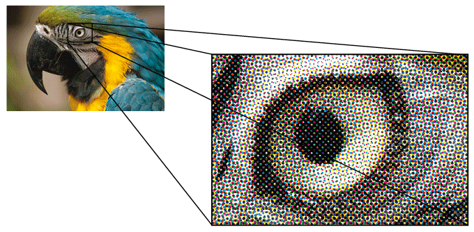
Is it pixelated meaning you're actually seeing jagged edges? Or do you mean that you can see a dot pattern like it was printed CMYK?
Quoted from Ed209:I did. Was disappointed in the quality. The front decal looks pixelated like it's not from vector art, most noticeably in the Funhouse logo. The side and backbox print quality isn't as bad but not up to par with the Pheonix Arcade ones. Kind of a bummer considering I've been really happy with all of the other Next Gen cab decals I've ordered.
Yikes. That's what I was afraid of. Do you have any pictures you can share?
To be fair this is close up. From a distance it would not be as noticable. This also mostly concerns the front logo. The pixelation isn't apparent on the rest of the decals. If they fixed this along with the grey circles in the logo the decals would actually be pretty solid.
Quoted from Aurich:Is it pixelated meaning you're actually seeing jagged edges? Or do you mean that you can see a dot pattern like it was printed CMYK?
print-design-parrot-CMYK-dots.gi... 119 KB
Yep. Dots.
Quoted from MrArt2u:Oh, man, as a graphic artist that would drive me insane. It pains me to even look at it. Have you mentioned it to Rick yet? I'm sure he'd want to see it corrected like he did the Bad Cats decals.
Yeah, that's pretty bad. It looks like a bad grey market copy, not something officially licensed. ![]()
Quoted from Aurich:Yeah, that's pretty bad. It looks like a bad grey market copy, not something officially licensed.
But why dots on the grey, Aurich? You know this stuff! Everything else looks great...why can't they get the same smoothing on the grey section?
Quoted from beelzeboob:But why dots on the grey, Aurich? You know this stuff! Everything else looks great...why can't they get the same smoothing on the grey section?
Probably because they're printing in CYMK instead of screen printing each separate color as a spot color. It's the achilles heel of the digital age of printing large format artwork.
That means that the grey is actually a half-toned percentage of black instead of a solid grey color. Two completely separate ways to get a light grey color that totally reveal themselves upon closer inspection.
I'd have to look at an original FH translite to really be able to compare what's a print artifact and what's part of the original design.
But that's why I was asking about the dithering earlier, to see if these are really just high end inkjet prints. That's what I think the new MMr translites are based on looking at them up close at Expo.
Old school translites, and the ones that I do, are actually done with a photographic process, not ink. So they're actually RGB and not CMYK. When CPR is doing their mirrored backglass conversions they have to print them CMYK with spot mirror ink, and that's why they struggle to convert some of the colors, process CMYK just can't do the same color range as true RGB.
I just want everyone to know that Planetary contacted me with apologies that this slipped by. They said they'll fix it, and I look forward to getting a good one!
Great customer service, as far as I'm concerned...
Now THAT'S a nice translite! I'm still waiting for a new one, but at least all your print lines up properly. (Of course, God hates me, so I got the one bad one!) I'm still not a fan of the pixelation, but here's something I noticed today:
When I held my original translite (the Williams one) up to the sunlight, you could see the pixelation in the grey of the translite. When you move it away from the light, it looks like smooth grey shading. I don't know why that is, or if Williams printed it twice or what. Weird. ![]()
Quoted from gms1975:Finally got my new translite installed today. It looks a ton better than my old yellowed one.
IMG_3985-856.JPG 131 KB
IMG_3984-752.JPG 243 KB
can you now post a side by side to compare ?
Can't really tell much of a difference when they are next to each other and are not backlit. When lit from behind my old one looks terrible. My old one looks fine laying on a table. Would make a fine poster, just not a translite anymore.
Quoted from gms1975:Can't really tell much of a difference when they are next to each other and are not backlit. When lit from behind my old one looks terrible. My old one looks fine laying on a table. Would make a fine poster, just not a translite anymore.
Don't see where I am from often in posts. Grew up in Brookmount subdivision but last time I visited St. Peters it just kept looking more and more built up. Behind where I grew up used to be a private farm but that was built over. We had a neighborhood pool that was gone if I'm remembering correctly (was run by the city), and the farm was long sold and starting to be made into apartment complexes. I used to sneak onto that land and we'd walk a mile or so to the farm's edge, across a couple creeks, past the cows. We used to think we'd get shot with rocksalt if we were ever caught. Funny things I remember.
Wanna join the discussion? Please sign in to reply to this topic.

Great to see you're enjoying Pinside! Did you know Pinside is able to run without any 3rd-party banners or ads, thanks to the support from our visitors? Please consider a donation to Pinside and get anext to your username to show for it! Or better yet, subscribe to Pinside+!

This page was printed from https://pinside.com/pinball/forum/topic/fs-funhouse-31-1357-50003-next-gen-2-translite-finally and we tried optimising it for printing. Some page elements may have been deliberately hidden.
Scan the QR code on the left to jump to the URL this document was printed from.